


And where better a place to start than with the all-time number 1 cult kit from the annals of history. The reason for its notoriety can be summed up in one word - brown. Yes folks, we give you THAT Coventry Kit from the mid-to-late-1970's.
So who was to blame for this fashion 'faux pas'? It was Admiral, one of the most well-known kit manufacturers in Britain at that time. They shot to fame in 1974 when the FA chose the Leicester-based company to produce a new England strip that would appeal to the growing commercial market. The result was the first England strip to feature stripes on the sleeves, shorts and socks, a move that prompted Jimmy Greaves to refer to them as 'pyjamas'.
The signs were obviously there from the start, but undaunted, Admiral continued to find clubs and countries from far and wide that were willing to wear their apparel, and one of them was Coventry City.
Admiral created a new range of kits in the the mid-70's which featured an alarming triple stripe that curved in from the sides of the shirt and ran all the way down to the bottom of the shorts. You may recall Wales wearing a colourful version of it in red, yellow, and green, but for Coventry it was only ever going to be the tasteful hues of sky blue, white and navy blue.
But then came that fateful day when the chairman, director and manager all sat round the table to choose a new design for the away kit. God only knows what must have been going through their minds. Perhaps they'd been out for an extra-long lunch at the pub or something. Who knows, but the result of their temporary lapse of reasoning was that Coventry City would for the next couple of years visit many of their opponents bedecked in brown, white and black. I think you'll agree, it was an absolute vision of loveliness. [IRONY.]
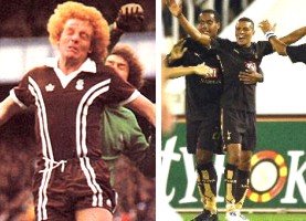
Ian Wallace (Coventry City, circa 1976) and Jermaine Jenas (Tottenham, 2006).
The odd thing is that just before the start of this season (2005/06), Tottenham resurrected the brown kit ploy thanks to their new manufacturers, Puma. With a splash of gold here or there, it looks rather more acceptable than the old Coventry strip ever did, but that colour's still rather alarming. Will we have to wait another 30 years before we see brown come back to the world of football kit design? Maybe not, if it's designed in the right way, but then that'll depend largely on whether Admiral are involved.


5 comments:
Didnt that Coventry kit win the poll for "Worst ever football kit" fairly recently?
Then again, there are so many polls nowadays, it probably one a "Best ever kit" somewhere.
The Spurs brown and gold kit harks back to clubs early days of around 1895 - which is how much you can buy it for if you shop around.
Of course, its also a good money spinner, although I'm sure that had nothing to do with it...
Not British but Paris St Germain also have a brown change strip this year. It must therefore be considered chic. Brown is the new silver grey.
Blimey, you're right! Brown is making a comeback - it's official!
BUT WAIT - NOT SO FAST... check out the pattern on the shirt.
PSG away kit
Is it not decidedly pyjama-esque? Surely that could damage it's commercial potential...?!?
This kit was actually chosen by the clubs kit man at the time (Jimmy Herbert who sadly passed away in 2006). He was with the Sky Blues for 18 years. Even though the kit has been nominated as the worst in footballing history Jimmy always maintained he liked it. By the way the home shirt was sky blue with white and navy blue stripes (not black). There was also a red away shirt with white and navy trim and a very rare yellow away shirt with black trim.
Thanks very much indeed for your comments, Mike - very interesting.
I've amended the article to include the clarification you made about the stripes being navy blue rather than black. Always nice to get confirmation on these things.
I don't think I've ever seen the red or yellow variants on the original design, but I'd very much like to! I think Admiral made a real design classic there!
Post a Comment